Hello lovely people,
I'm bringing you a triple whammy for my Dies to Die For DT inspiration this week!
Isn't it great when a stamp and/or die set inspires you so much that you instantly have a trillion ideas for how you want to use it?
That's how I felt when I saw this beautiful stamp and die set from Pretty Pink Posh, so I wanted to showcase just a few ways to use it :-)
For this card I stamped the outer wreath and central element onto separate pieces of white stamping card and coloured them.
Then I cut the outer wreath into a square and layered the central piece into the middle using foam pads.
I've used both the outer wreath and central element for this second card as well, but stamped them both on the same piece of stamping card, then coloured them and cut the whole thing out with the outer edge die.
Again, I've layered the piece onto the card with foam pads for dimension and this time I've added one of the little sentiments underneath.
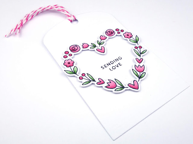
Finally, for my tag I stamped just the outer wreath, coloured it and cut out with the wreath die.
I stamped a sentiment onto the tag and layered the wreath over it using, yes you guessed it, foam pads!
As you can see, I kept the designs simple because my main aim was to show some different ways to use the stamps/dies...oh, and because I like it CAS - lol!
There are even more ways to use this set but I think that's quite enough for now!
If I've tempted you with any of the lovely supplies I've used then you can go straight to the individual products via the links below or just pop over to Dies to Die For and have a little browse around!
Thanks for popping in and I hope you have a beautiful day!
Lovely things I've used from Dies to Die For;
Floral hearts stamp set - Pretty Pink Posh
Floral hearts co-ordinating dies - Pretty Pink Posh
A2 stitched rectangle STAX 2 - My Favorite Things
Fancy frames squares - Sunny Studio
Classic tag 1 - Neat and Tangled
Dots and stripes sorbet 6x6 pad - My Favorite Things
Copic colours;
Flowers: R81, R83, R85
Leaves: YG61, YG63


These are so very pretty. I like the way you have raised the centre part on the first card and the shocking pink sets it off so well.
ReplyDelete